
LEARNING REFRESHER: Tips on Analyzing Data
Last year, in the April 2020 issue of VOICES, we identified examples of project management and LSS principles being applied in real time by businesses and governments responding to the COVID crisis. Recently, we asked Joe Valvona, a Master Black Belt and former BPG Regional Director and LSS instructor, to share some of his thoughts on how Lean Six Sigma concepts can be applied to COVID
What is a Trend?
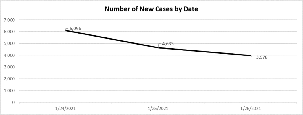
I’m sure many readers have watched news reports when the newsperson shows the daily graph of the number of new COVID-19 cases or the number of persons hospitalized. Either of the graphs may show a steadily increasing line with the latest data point lower than the last one, or even two data points lower than the previous one. The newscaster proclaims that the number of new cases is trending down. Below, are actual data on the number of cases by report date for selected consecutive days in January 2021 in North Carolina.*
Now, let’s look at the next few days.
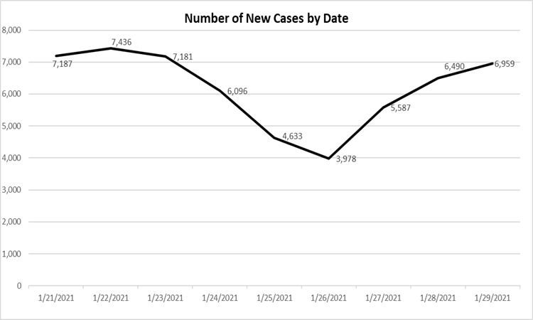
The three days after January 26, 2021 were each higher than the previous day. Does this mean we are trending to more cases each day?
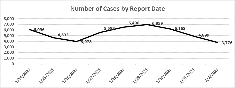
Well, the next three days were each lower than the previous day. The number of daily cases reported after February 1, 2021 go up and down.
So, what do we conclude? Be careful how you react to individual data points and don’t assume a trend is happening because one or two data points go in the same direction. One of the Lean Six Sigma SPC rules for special cause variation is seven consecutive points in the same direction (up or down).
By the way, here is what the data look like for the period January 1, 2021 to February 20, 2021:
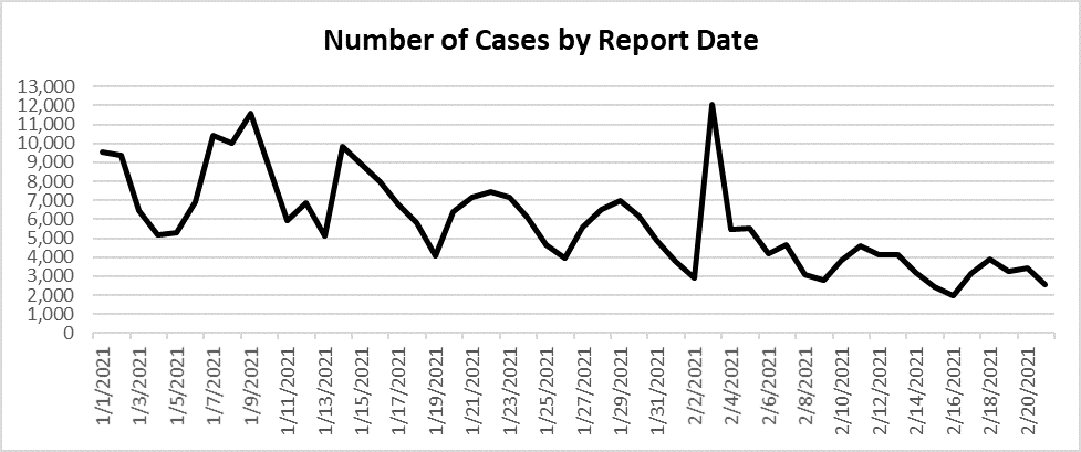
What do you conclude now? Additional data points and the insertion of a trend line or line of best fit shows an overall downward slope from the beginning of January through February 20. This raises a number of questions:
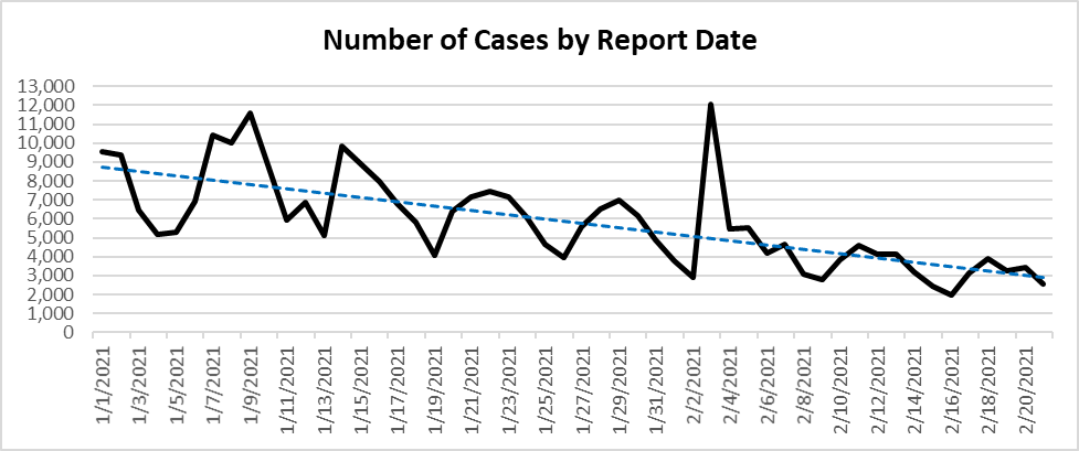
Is the trend we see predictive of future results? One can do a regression analysis to identify any variables (or inputs) that have a statistically significant impact on the outcome/output (number of cases). In this case, the only input we have is time (Report Date). This alone will not give us any meaningful insight into what might impact the number of reported cases.
The CDC (and other reporting entities) use a moving average (usually 7-14 days) to smooth out spikes in data that might not have any real significance. Below, is the seven-day moving average for the data above.
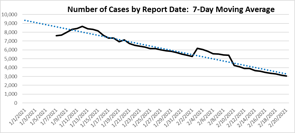
With the exception of a few days in early February, the 7-Day Moving Average graph shows a steadily declining number of reported cases from mid-January to the end of the period covered. The big question now is Why? That is where your Lean Six Sigma investigative skills come into play.
How meaningful is the information in this chart? While number of new cases is important, the information becomes more meaningful when paired with other data, such as the number of new cases by virus type (since we now know about virus variants), population characteristics (age, sex, race), or the relationship between number of new cases and projections on future hospitalizations.
How to Make Sense of COVID Data: What Do You Want to Know?
With the wealth of data available on COVID from around the world, it’s easy to get overwhelmed or deeply immersed in detail. So, as you hear metrics about COVID, here are some tips for not getting overwhelmed. If you are interested in learning more about analyzing data from any source, the tips still apply.
First, ask yourself what you need or want to know. Are you evaluating your community’s reopening plans? Finalizing family travel plans? Looking for the best face mask? Writing a school paper on COVID’s impact on just about anything? (In the DMAIC model this would be defining the problem. What is the relevant Problem Statement?).
Gather the data you need. You’ll find good baseline data from the CDC and state websites. In addition to the basic data on number of cases, you can drill down by state, community, population, etc. Some basic metrics to consider are new cases (by virus strain), positivity rates, and hospitalizations. Find the metrics that will help answer your questions.
Analyze the data with an understanding of how the data were collected and how representative they are for your needs. Put aside any preconceptions and follow the story the data tell you.. Then determine your next actions. And in such a volatile environment continue to monitor the data and make adjustments as needed.
*The graphs used in this article were created from data downloaded from North Carolina’s Department of Health and Human Services website (https://covid19.ncdhhs.gov/dashboard/data-behind-dashboards).